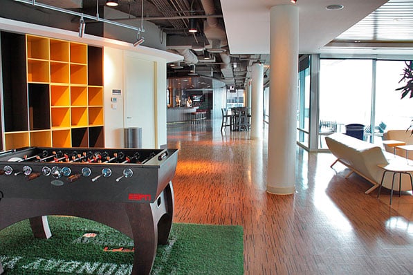
While referencing the experience of stepping into an old-world brewery may be the design focus of MillerCoors’ headquarters in downtown Chicago, it’s clear that boosting employee morale through a stimulating, carefree environment is also on tap. Named in honor of MillerCoors’ founders, the Fred & Adolph’s Pub occupies the top floor of the sprawling 16th floor high-rise along the Chicago River, and its brewery-inspired design scheme is full of reminders that an “all-work-and-no-play” philosophy is simply not the MillerCoors way. Here, Nick Luzietti, design principal at VOA Associates Incorporated, the firm in charge of the corporate interior design for the MillerCoors headquarters, breaks down the key design elements of the much-buzzed about pub.

Although raw elements and loft motifs define the pub area, some sections of the 130,000-square-foot space reflect a “dressier, European-style” design meant to echo the sophistication of MillerCoors’ premium beers and international clientele. Sleek furniture in “warm harvest hues of yellows and browns” also helps create an element of elegance and excitement. An updated cork floor reflects MillerCoors commitment to sustainability (the headquarters was certified LEED Silver).

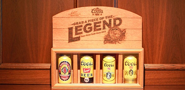
Brewery references, a clear love of beer, and a spirit of camaraderie are at the heart of the dynamic Fred & Adolph’s Pub. MillerCoors’ products are prominently displayed throughout the space. “They wanted a ‘beer land,’” says Luzietti of the space. It seems they got that and much more.

